The brief
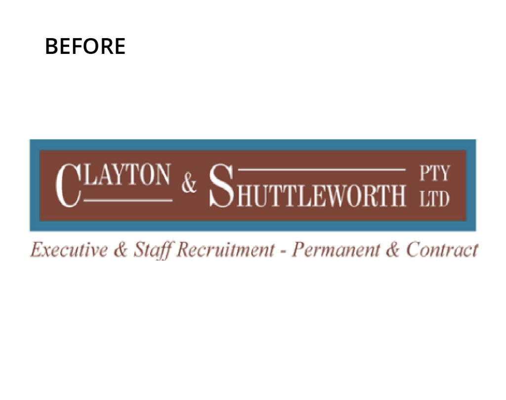
Clayton & Shuttleworth Pty Ltd had identified that their image hadn’t kept up with their growth. It was outdated and stale and needed to be reinvigorated if it was to help the company grow and prosper.
Our creative process
The first thing we did was simplified the name. The ampersand (&) and Pty Ltd were just creating unwanted noise in the name, so we eliminated them. We moved away from the burgundy/brown colour and modernised the teal into something a little more energetic. We updated the typography as well and then finally, developed the ‘hourglass ribbon’ icon to dovetail with the ‘experience counts’ brand message, with the hourglass representing the decades of experience and expertise that differentiate Clayton Shuttleworth from the pack.
Words from the client
“Kingfisher was pivotal in the re-branding of our company. They clearly understood where our company sat within the marketplace and what we were aiming to achieve in the future. Kingfisher responded with a modern, relevant brand and upgraded our outdated, tired website into one that clients and visitors find very attractive. I would recommend any business wanting to re-brand or upgrade their website use Kingfisher.”
– Shane Clayton, Partner, Clayton Shuttleworth


Contact us now on 07 4637 8893 or send us an email.
