The brief
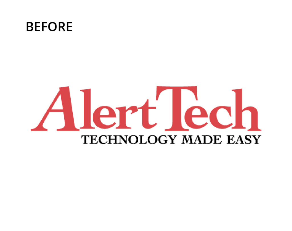
Alert Tech’s logo was dated and failing to present the company appropriately, especially in a technology-related sector of healthcare. In short, the logo made them look less than they were, and this needed to be repaired if the company was to have a foundation on which to grow and prosper.
Our creative process
The name and brand position needed to stay, so we started with a far more modern and appealing typographic style. We softened the colours and added grays rather than black to take the stark edge off the brand. We also developed an icon to go with the name to further differentiate the brand for its competitors.
Words from the client
Kingfisher has been working as our marketing consultants for some time now. They have a wealth of knowledge and expertise that has assisted our business to make our offering far more professional.


Contact us now on 07 4637 8893 or send us an email.
